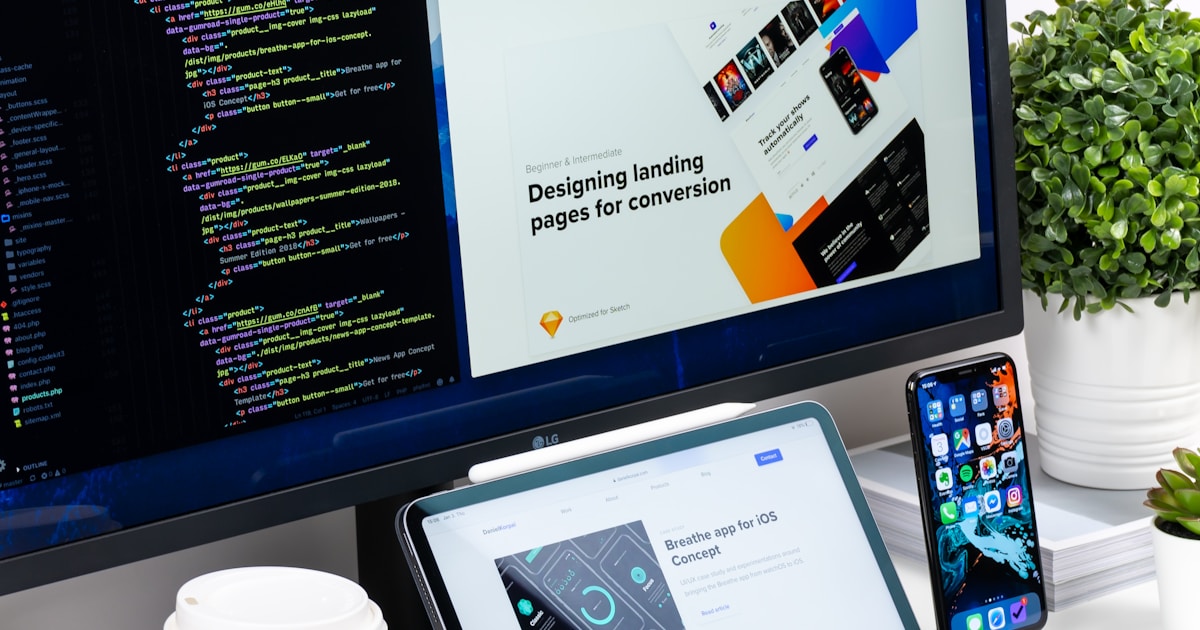
Das ist die Lektion, in der Vibe Coding wirklich klick macht. Du wirst eine professionell aussehende Landingpage bauen, ohne eine einzige Zeile Code von Hand zu schreiben. Stattdessen beschreibst du, was du willst, und Claude Code baut es fuer dich.
Die Kunst des Promptens
Die Qualitaet deines Prompts bestimmt direkt die Qualitaet des Ergebnisses. Hier ist die Entwicklung:
Schlechter Prompt:
"Mach eine Landingpage."
Claude wird irgendetwas bauen, aber es wird nicht das sein, was du dir vorgestellt hast. Zu vage.
Guter Prompt:
"Create a landing page for Waitlist Wizard with a hero section that has a headline 'Be the first to know', a subtitle explaining we're building something new, and a centered email signup form with a blue submit button. Use a clean, modern design with lots of whitespace."
Besser -- Claude kennt die Struktur, den Inhalt und die allgemeine Aesthetik.
Grossartiger Prompt:
"Create a landing page for Waitlist Wizard with a hero section that has a headline 'Be the first to know', a subtitle 'We're building something special. Join the waitlist and be among the first to get access.' Centered email signup form with a navy blue (#1e3a5f) submit button. Use the Inter font from Google Fonts. The color scheme is navy blue (#1e3a5f) and white. Fully responsive. Clean, modern SaaS design with generous whitespace."
Jetzt hat Claude Farben, Schriftarten, Text und Designrichtung. Das Ergebnis wird sehr nah an dem sein, was du willst.
Konzept
Prompting ist eine Faehigkeit, kein Talent. Du wirst mit der Uebung besser. Der Schluessel ist Spezifitaet: Sei klar darueber, was du willst, nenne visuelle Details (Farben, Groessen, Layout) und beschreibe das Gefuehl, das du anstrebst.Die Hero Section bauen
Lass uns mit dem Bauen beginnen. Oeffne Claude Code in deinem Projektordner:
Probier es aus
Tippe in Claude Code diesen Prompt:"Replace the content of app/page.tsx with a landing page for Waitlist Wizard. Create a hero section with: - A headline: 'Be the First to Know' - A subtitle: 'We're building something special. Join the waitlist and be among the first to get access when we launch.' - A centered email signup form with an input field and a navy blue submit button - Clean, modern SaaS design with generous whitespace - Use navy blue (#1e3a5f) as the primary color and white background - The page should be fully responsive"
Claude generiert den Code und schreibt ihn in app/page.tsx. Schau in deinem Browser unter localhost:3000 nach -- du solltest deine Landingpage sehen!
Weitere Sektionen hinzufuegen
Eine grossartige Landingpage hat mehr als nur eine Hero Section. Lass uns Features und Social Proof hinzufuegen:
Probier es aus
"Add a features section below the hero with 3 cards in a row. Each card should have an icon, a title, and a short description. The three features are: 1. 'Lightning Fast' — 'Get notified instantly when we launch. No spam, ever.' 2. 'Early Access' — 'Be among the first to try new features before anyone else.' 3. 'Free Forever' — 'The waitlist is free. No credit card required.' Use subtle icons and keep the design consistent with the hero."Dann fuege Social Proof hinzu:
Add a simple social proof section below features. Show "Join 2,000+ people
already on the waitlist" with a row of small avatar circles (use colored
circles as placeholders). Keep it minimal and trust-building.
Und einen Footer:
Add a simple footer with "Built by Waitlist Wizard" on the left and links
to "Privacy Policy" and "Terms of Service" on the right. Use a subtle
border-top to separate it from the content.
Responsiv machen
"Responsiv" bedeutet, dass deine Seite auf Handys, Tablets und Desktops gut aussieht. Da wir Tailwind CSS verwenden, handhabt Claude das meiste davon bereits -- aber lass uns ueberpruefen und alles korrigieren, was nicht stimmt.
Probier es aus
Oeffne in deinem Browser die Developer Tools (F12 oder Cmd+Option+I auf Mac). Klicke auf das Geraete-Toggle-Icon (sieht aus wie ein Handy und Tablet), um die Mobile-Ansicht zu sehen. Wenn etwas seltsam aussieht, sag Claude: "The features cards overlap on mobile. Make them stack vertically on screens smaller than 768px."Mit Claude iterieren
Das ist der Kern des Vibe-Coding-Kreislaufs: beschreiben, ueberpruefen, verfeinern. Probiere diese Verfeinerungen:
- "Make the headline bigger — 48px on desktop, 32px on mobile"
- "Change the submit button color to a gradient from #1e3a5f to #2d5a8e"
- "Add a subtle gradient to the hero background — white to light blue (#f0f7ff)"
- "The spacing between sections feels too tight. Add more padding — at least 80px between each section."
Jedes Mal aendert Claude den Code, und dein Browser aktualisiert sich sofort. Dieses Hin und Her ist schnell, macht Spass und ist ueberraschend produktiv.
Pro-Tipp
Wenn Claude eine Aenderung macht, die dir nicht gefaellt, sag einfach: "Undo that last change" oder "Go back to how it was before." Du kannst auch Git nutzen:git checkout -- app/page.tsx, um die Datei auf den letzten Commit-Stand zurueckzusetzen.
Git Checkpoint
Deine Landingpage sieht grossartig aus. Zeit zum Speichern:
git add .
git commit -m "landing page complete with hero, features, social proof, and footer"
Ehrlicher Hinweis
Du hast gerade eine professionell aussehende Landingpage gebaut, ohne Code von Hand zu schreiben. Aber hier ist, was zaehlt: Du verstehst, was gebaut wurde. Du weisst, dass es eine Hero Section gibt, eine Features Section, einen Footer. Du kennst die Farb- und Layout-Entscheidungen. Dieses Verstaendnis ist das, was Vibe Coding von blindem Copy-Paste unterscheidet. Du leitest den Bau -- KI fuehrt ihn aus.Wichtigste Erkenntnis
Du hast gerade eine professionelle Landingpage gebaut, indem du ein Gespraech mit KI gefuehrt hast. Die Faehigkeit ist nicht Code tippen -- es ist klar beschreiben, was du willst, und am Ergebnis iterieren. Das ist Vibe Coding.